Choosing the right exterior paint colors for your home is one of the most impactful decisions you can make as a homeowner. The color of your home sets the tone for your entire property, communicates your personal style, and plays a major role in curb appeal and resale value. It’s also a decision that’s going to be very visible and very permanent for the next several years, which is exactly why so many homeowners find it more stressful than they expected.
The good news is that with the right approach, choosing exterior paint colors doesn’t have to be overwhelming. At Greg Unseth Painting & Exteriors, we’ve been helping Colorado Springs homeowners navigate this decision for over 40 years, and we’ve learned a thing or two along the way. Here are seven practical tips to help you choose an exterior color scheme you’ll love coming home to every day.
1. Plan Around Your Home’s Fixed Elements
Before you even start looking at paint swatches, take a good look at the permanent features of your home that you can’t change or that would be extremely expensive to change. This includes your roof color, stone accents, concrete or brick steps, driveway material, mature trees and shrubs, and any other fixed elements that are going to stay regardless of what color you paint the house.
These fixed elements are your starting point. Your exterior paint colors should either complement or contrast them intentionally rather than clash with them accidentally. For example, a warm-toned roof with red or brown undertones will pair beautifully with earthy warm paint tones and look awkward next to cool grays or blues. Getting this foundation right makes everything else fall into place much more naturally.
If your home has stucco or stone accents, those elements deserve extra consideration since they carry a lot of visual weight on the exterior. Check out our stucco services and stone veneer services if you’re thinking about updating those elements as part of a broader exterior refresh.
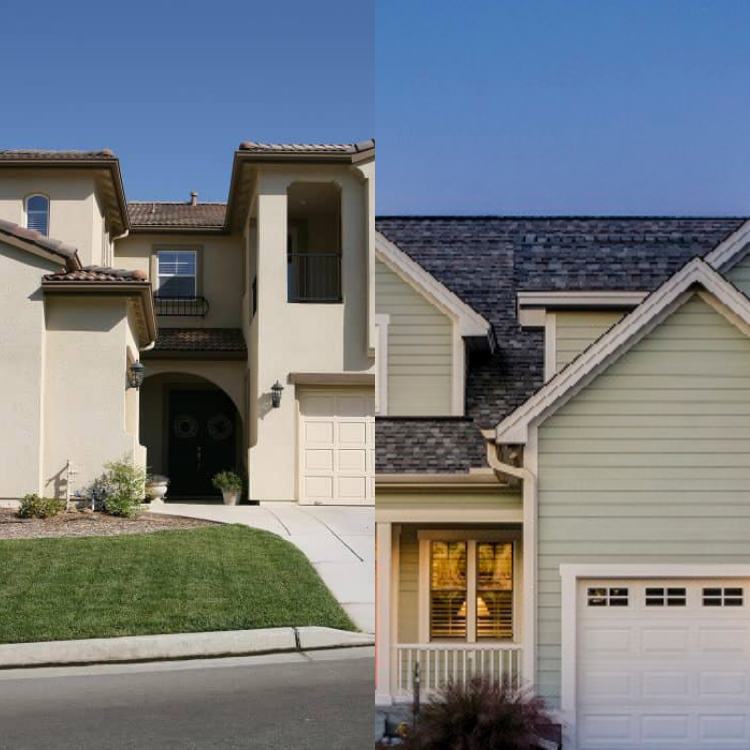
2. Consider Your Home’s Architectural Style
Every architectural style has a color language that has developed over decades, and working with that language rather than against it will almost always produce a better result. A classic Victorian home has a very different color palette than a modern ranch, a craftsman bungalow, or a contemporary stucco home.
Reputable paint companies like Sherwin Williams publish historically accurate color palettes organized by architectural style that can serve as a great starting point. If you’re working with a more distinctive or unusual home style, consulting a color specialist or architect can help you identify colors that honor the character of your home while still expressing your personal taste.
In Colorado Springs, where you see everything from historic Victorian homes in the Old North End to modern stucco homes in newer developments, matching paint colors to architectural style makes a particularly noticeable difference in how well a home fits into its neighborhood.
3. Decide What Visual Effect You Want to Create
Paint color isn’t just about aesthetics. It’s also a powerful tool for creating visual effects that change how your home reads from the street. Understanding how color affects perception can help you make a more intentional choice.
Darker, deeper colors tend to make a home feel more grounded and nestled into its surroundings. They can make a house feel like it recedes slightly into the landscape, which works beautifully for homes with a lot of mature trees or lush landscaping. Lighter, brighter colors do the opposite, making a home pop and appear more prominent from the street, which can actually make it seem closer to the curb than it really is.
If you have a smaller home and want it to feel more substantial, lighter colors with strong contrast on the trim and accents can help. If you have a large home that feels imposing and want to soften it slightly, deeper tones can help it settle into the landscape more gracefully. Think about what you want your home to feel like from the street and let that guide your color direction before you start looking at specific shades.
4. Think in Triples
One of the biggest misconceptions homeowners have going into an exterior paint project is that they’re choosing one color. In reality, a well-executed exterior paint scheme typically involves two to three colors working together, and understanding how those layers interact is key to a result that looks polished and intentional rather than flat and one-dimensional.
Here’s how the three layers typically break down. The base color is the dominant color applied to the main body of your home. This is the color that will define the overall look and feel of the exterior. The accent color is used on doors, shutters, and other architectural details that you want to highlight and draw attention to. The trim color is applied to window and door casings, rooflines, fascia, and other framing elements that define the structure of the home.
As a general rule, if you choose a darker base color, opt for a lighter trim to create contrast that makes the architectural details pop. If you go with a lighter base, a slightly deeper trim color can add definition and keep the exterior from looking washed out. The interplay between these three colors is what gives a home that polished, magazine-worthy look that makes people slow down as they drive by.
Our team at Greg Unseth Painting & Exteriors is happy to help you work through color combinations during your free estimate. With decades of experience applying color to Colorado Springs homes, we’ve developed a strong eye for what works and what doesn’t. Learn more about our exterior painting services and how we approach the color selection process with our customers.
5. Test Your Colors Before You Commit
No matter how much you love a color on a swatch or on a screen, there is simply no substitute for seeing it on your actual home in real-world conditions before you commit. Paint colors look dramatically different depending on the light conditions, the surrounding landscape, and the other colors they’re placed next to, and what looks perfect in a brightly lit paint store can look completely different on the north-facing wall of your home on a cloudy Colorado afternoon.
The easiest way to test colors before committing is to pick up sample pots of your top two or three choices and paint a generous section of your home’s exterior with each one. Tape paint swatches to the exterior as a starting point if you’re in the early stages, but move to actual painted samples once you’ve narrowed it down. Observe them at different times of day including morning light, afternoon sun, and evening shade, as well as on both bright sunny days and overcast days. Colorado Springs light is particularly strong at altitude, which can make colors look more intense than they would at lower elevations.
This small investment of time and a few dollars in sample paint can save you from a very expensive and very visible mistake.
6. Build an Inspiration Collection
Before you ever set foot in a paint store, spend some time collecting visual inspiration. Pinterest is an excellent resource for this, and creating a dedicated board for exterior home colors is one of the most effective ways to start identifying patterns in what you’re drawn to.
Search for homes that share your architectural style and save images of color combinations that catch your eye. After pinning a few dozen images, patterns will start to emerge. You might notice that you’re consistently drawn to warm tones, or that you keep saving homes with dark bases and bright white trim, or that you love a particular style of accent color on front doors. Those patterns tell you something important about your color instincts that can guide your decision in a much more intentional direction than starting from scratch in front of a wall of swatches.
You can also drive through Colorado Springs neighborhoods you admire and take note of homes whose exterior colors appeal to you. Seeing colors on actual homes in your climate and landscape is far more useful than looking at them in a catalog or on a screen.
7. Do a Room Test
If you’re in the final stages of narrowing down your color choice and still feeling uncertain, consider doing a room test before making your final decision. Choose an interior room that gets varying levels of natural light throughout the day and paint it with your top exterior color contender. This gives you a chance to live with the color for a few days, observe how it changes in different light conditions, and get a genuine feel for whether you’re going to be happy with it long-term before it goes on the entire exterior of your home.
This approach works particularly well for homeowners who are considering a bold or unusual color choice and want to build confidence before committing. It’s a low-risk way to test your instincts and either confirm your choice or catch a potential mistake before it becomes a very visible one.
Ready to Get Started?
Choosing the right exterior paint colors for your Colorado Springs home is a process worth taking seriously, and these seven tips should give you a solid framework for making a decision you’ll be genuinely happy with. When you’re ready to move from planning to painting, Greg Unseth Painting & Exteriors is here to help.
With over 40 years of experience painting homes throughout Colorado Springs and the Front Range, our team brings expertise in color selection, surface preparation, and professional application that ensures your finished exterior looks exactly the way you envisioned it. We use only professional-grade Sherwin Williams products and back our work with industry-leading warranties.
Contact us today to schedule your free estimate and start the conversation about your next exterior painting project. And if you’re considering updating more than just the paint, check out our full range of exterior services including stucco, siding and trim, windows and doors, and decks to see everything we can do for your home’s exterior.